Navigate back to Articles page
It’s true: You’re a typographer. It’s probably not a title you asked for or even knew you’d earned, but if you use a computer to make things with words, then yes, you’re very much a typographer. And type is really important, because its is a fundamental piece of nearly everything we consume. In the following paragraphs, we’ll discover what typography actually means, how you became a typographer, and most important, how you can wield this newfound talent to greatly improve user experiences and everyday marketing projects.
What is typography?
Simply put, it’s the arrangement and appearance of content. At first read this can sound pretty basic, and you wouldn’t be alone in thinking that. But it’s this fundamental utility that makes typography such a critical piece of nearly every design imaginable. And don’t be fooled, typography implies much more than simply selecting a font and typing away. Employing type on a page requires an understanding of content hierarchy, whitespace, readability, and visual aesthetics (or at least it should.) But before we discuss the art of typography, let’s understand how you became a typographer.
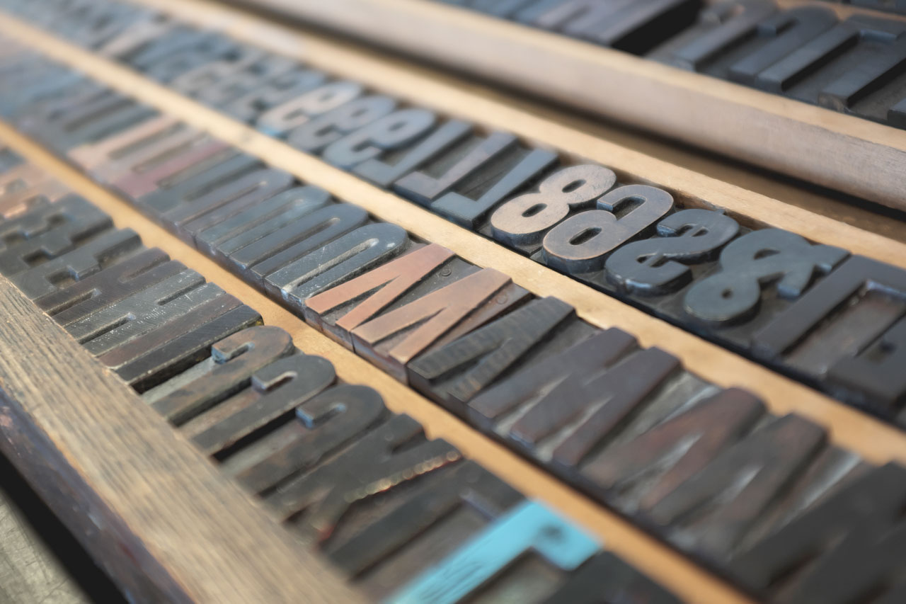
The barrier for using professional typefaces and advanced typographic principles has been steadily declining for more than 500 years. The first major advancement in typographic history was the printing press, which brought printed books to the masses and created a new industry for professional typographers. The print movement grew steadily over several centuries, and then another major advancement turned the industry on its head and brought the means of typesetting to the everyday person: The personal computer.
Our entry into the digital age brought efficiency, convenience, unprecedented access to information, and a WYSIWYG platform for making high-quality designs with type. Think word processors like Microsoft Word or Google Docs—these kinds of tools are packed with quality typefaces and basic typographic presets. Almost anyone with a bit of patience can use these tools to output (nearly) professional-looking documents and designs. Coupled with the advent of networking and the ‘World Wide Web,’ typography has a new mission and a massive new set of practitioners, which includes you!
How do you make good typography?
Unfortunately, it’s a skill that few take seriously. There’s a large disparity between those who are skilled in typography, and the massive firehose of content and media in the world today. But it only takes two simple steps to begin the journey towards typographic excellence:
-
Create a type system
Take a look at most any content and you’ll quickly recognize that some words and sentences are more important than others. Recognizing this content hierarchy is the first step in becoming a good typographer.
For instance, let’s take the title of an article. This initial set of words is hugely important to a reader, as it helps them determine what the article is about and whether they should continue reading. You can emphasize the title by using a larger type size, bold version of the existing typeface, complimentary typeface, or any combination of the three.
This applies to the rest of your project too. From the start, identify the different layers of hierarchy in your content and assign an appropriate type style (size, font weight, etc.) for each layer. Make sure each layer creates the right amount of contrast from one another while still maintaining a complimentary appearance.
-
Whitespace
In music, it is often said that the space between notes are just as important as the notes themselves, and I can’t think of a better way to describe the relationship of type and space. Whitespace might be the most effective tool a typographer has in their arsenal, and it’s all about reinforcing content hierarchy and aiding readability.
Including whitespace on your left and right margins can help keep line lengths short, which will increase the reader’s focus on the content. Adding vertical space between paragraphs, sections, etc. provides the eye a place to pause between sections, reinforces important breaks in the story, and creates a more readable document. In other words, whitespace improves readability.
That’s it!
Well, not exactly. There’s a lifetime of lessons to learn in the pursuit of better typography, but creating a type system and understanding the power of whitespace will give you a solid foundation in typography and improve the overall user experience in your designs, products, and documents.