Navigate back to Articles page
Wayfinding systems exist everywhere, physically and virtually. They help people navigate complicated environments efficiently and allow users to feel safe and oriented.
There’s more to wayfinding on the web than including links (and even menus). That’s why creating a good wayfinding system is essential. A good wayfinding system could answer the following questions on every screen (Apple):
- Where am I?
- Provide needed detail about what’s in that location
- Communicated through breadcrumbs, navigation menus, and tab bars
- Where can I go?
- Comprehensive and understandable list of locations that people can visit
- Communicated through the content area, tab bars, buttons, etc.
- What will I find when I get there?
- Highly contextual navigation that becomes increasingly specific as users navigate deeper into the system
- Communicated through button and link descriptions/labels
- What’s nearby?
- Help people orient themselves by highlighting their current location relative to the other location
- Communicated through navigation menus, breadcrumbs, and tab bars
- How do I get out?
- Provide a clear exit path to start over
- Communicated through back and cancel buttons
Wayfinding is important for all users—including those with low vision. For more information about showing “current” locations for screenreader users, please read Léonie Watson’s documentation on the aria-current attribute.
Optimizing wayfinding
Not only are the user interface (UI) elements listed above crucial to answering those five questions, but there are also six principles that could further enhance the wayfinding experiences (UX Matters).
-
Structured districts
This refers to how we divide an environment into different categories that match the users’ mental model. For example, when users think of classes, they might divide them into different schools or majors. This allows users to understand the information more effectively. To adopt this into a software’s wayfinding system, the primary navigation (such as the navigation menu) and the URL structure has to reflect these different districts.
-
Flexible layers
Users may need more than structured districts and categories to find specific information, especially in long lists of data or assets. Allowing users to filter by secondary criteria makes the experience more flexible for the user—and helps them find increasingly specific information. Filters can also contextualize navigation, increasing predictability and answering the question of “What will I find when I get there?”
Degrees & majors is a great example of a flexible layer. For example, the page is clearly and accurately categorized in the larger IU Bloomington site. But the filters let users find the exact degree and major they may want.
-
Positional cues
Positional cues directly answer the question of “Where am I?” They help users orient themselves and make them feel confident even in a complex navigation environment. In software, designers can use UI elements, such as highlighting the current tab of a navigation menu, to indicate where the user is. Use the aria-current attribute to inform screen reader users of their location within a website environment (tink).
It can be easy to overwhelm the user, so, use positional cues carefully. It’s like looking at a map where a “You are here” sign exists, but because the map is too complex, you can’t find the mark to locate yourself. A later section will discuss this.
-
Survey knowledge
Similar to how people use maps to figure out where to go next and how to get there, survey knowledge also orients users and answers the question “Where can I go?” UX Matters explains that data visualizations (like stars in ratings or even charts and graphs) are exceptional in helping users navigate information-heavy websites.
For example, Google shows a rating for each restaurant, which allows users to figure out which restaurants they might want to view in more detail. Without the rating shown for each restaurant, users may have a hard time distinguishing the differences between the restaurants.
-
Clear paths
Give users a clear path of how to move forward or backward. This lets users get to the needed information more efficiently. In addition to next/previous buttons and navigation bars, additional sections like related content or details could help users explore what they could do in a website. Marketing sites could greatly benefit from relating sections with similar content. For example, once the user has looked at a page and would like to find more information, a related section—with actions to follow up or learn more—lets users do so.
-
Coherent interactions
A user should not see different interactions when doing the same action. This is further detailed in the Audience report.
Conclusion
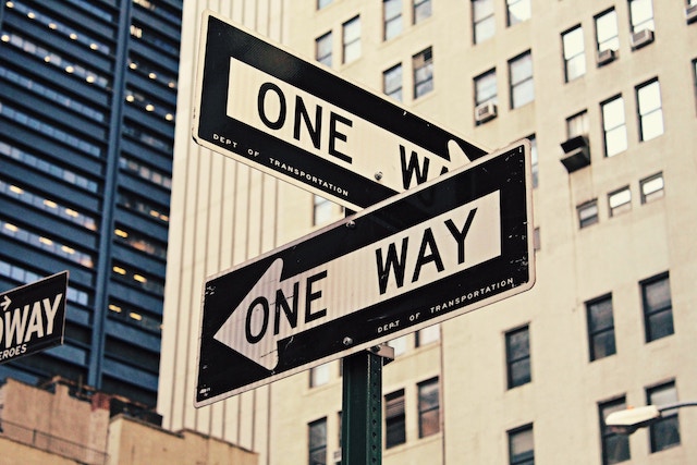
Online wayfinding systems are very similar to physical road signs. Both follow consistent standards, direct traffic, and communicate requirements or options. It’s also easy to get lost without them–which makes them an essential part of information architecture and UX planning.
Our next post will continue the discussion on wayfinding systems. We’ll focus on information architecture, hierarchy, and navigation elements like menus and breadcrumbs. Stay tuned!