Navigate back to Articles page
Both skeuomorphic and flat designs have benefits and drawbacks. Skeuomorphic designs tend to be more complex, whereas flat designs are usually more simplified and minimal. On the other hand, skeuomorphism often signals affordances more quickly, and although flat design can follow clear conventions, it’s more difficult to design unconventional experiences using a flat approach.
What’s the difference?
Skeuomorphic designs refer to graphics that look like real-life objects. For example, in image 1, the notes app resembles a notepad in terms of texture and color, and the games app resembles a poker table with the felt and wood texture.
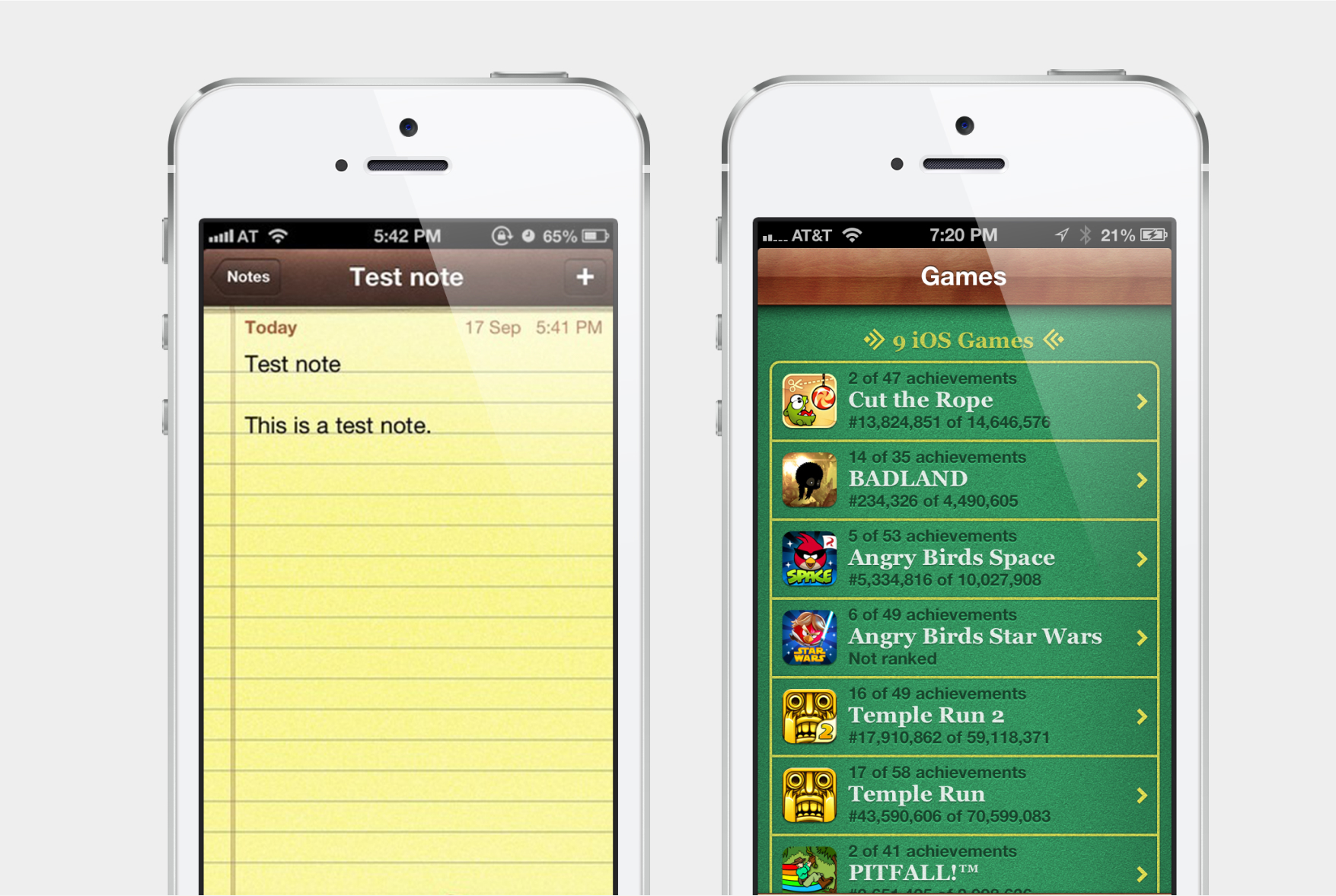 Image 1: These apps illustrate skeuomorphic design. They resemble a real-life notepad and poker table.
Flat designs avoid anything that resembles real-life visuals, like gradients, drop shadows, beveled edges, and so on. Many designers started to transition from skeuomorphism into flat design for its simplicity and cleaner look and feel. Microsoft’s Windows 8 and Apple’s iOS 7 adopted flat design earliest, and most software nowadays adopts a flat design language.
Skeuomorphism
Benefits & current uses
Skeuomorphic design effectively teaches users how to use new or complicated technologies by relating them to real-life objects. It also reduces the learning curve of a product (Interaction Design Foundation). But more importantly, skeuomorphic designs provide great affordances. An affordance tells users how to interact with an object. Successful skeuomorphic interface elements avoid the reliance of using popup text (or tool tips) to describe the use of it (Geoff Hart).
Although skeuomorphism is used less frequently in user interface design today, some applications still use this design style. Djay, a digital DJ’ing app, uses skeuomorphism to show a “physical” turntable due to the complexities of using a real-life DJ turntable. Paper, a drawing application, also adopts skeuomorphism by displaying the available drawing tools in their app to better represent those tools. The action of “drawing on a tablet” also mimics real-life interactions of drawing on a piece of paper, which perfectly illustrates skeuomorphic design.
As these examples illustrate, skeuomorphism is great for niche and complex applications where a steep learning curve exists and where connecting to a real-life item is essential.
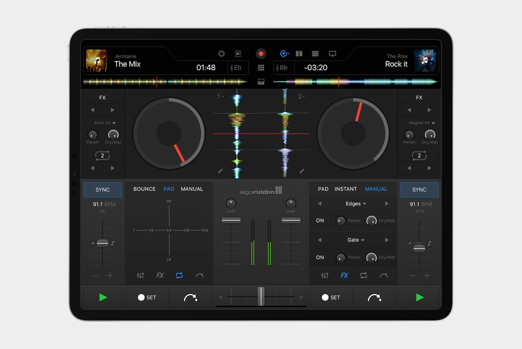 Image 2: This DJ’ing app looks like a turntable, another example of skeuomorphic design.
Drawbacks
As the concepts of computers and software become familiar to us, the need to teach users how to use a piece of software through skeuomorphism reduces. As mentioned before, skeuomorphism could increase the usability of a product, but it could be a double-edged sword. When executed poorly, skeuomorphism could become frustrating to users, as they already have a perception of how the element should behave (envatotuts+).
In terms of development, skeuomorphism can limit creativity, exclude people from designing software, and slow down website loading. For example, designers might apply a real-life object’s same constraints to their designs. They might also have difficulty creating a skeuomorphic design as it takes meticulous crafting (Syndicode). Finally, the heavy use of images, gradients, and shadows might affect performance.
Flat design
Benefits
Consistency is the biggest benefit of using flat design. Many user interfaces have adopted flat design, and users have gotten used to it as a convention. In other words, they have a sense of how many UIs work.
For example, prior to flat design, the concept of primary and secondary (ghost) buttons were foreign to most users, but with the emergence of flat design, users now understand that the button with a solid fill, for example, indicates the primary call-to-action, while the button with a border might represent something less important. As illustrated in the Audience report, when an element is consistent, users can expect that its functionality will remain the same—even when the environment changes.
Another benefit of flat design is scalability. Users increasingly rely on their mobile devices, where screen real estate is valuable. With fewer graphical nuances and effects, flat design tends to be minimalist (NN Group: Flat-Design Best Practices), which lets the user focus on the content. Poshly, a beauty startup redesigned their website to be more minimalist and flat, and they’ve seen benefits like a 20% increase in user engagement and easier mobile development (Entrepreneur).
Drawbacks
Despite the major benefits of flat design, flat design can present usability issues, especially in poorly-thought designs. Some reports of poor usability of early releases of flat design on Windows 8 and iOS 7 illustrate these issues.
Flat design could decrease discoverability for certain user interface elements. In Windows 8’s Metro Design, users have difficulty distinguishing the difference between clickable and non-clickable elements (image 3). Even the system’s icons sometimes do not convey interactivity, and icons are supposed to help users interpret the system and attract clicks (NN Group: Windows 8 — Disappointing Usability for Both Novice and Power Users).
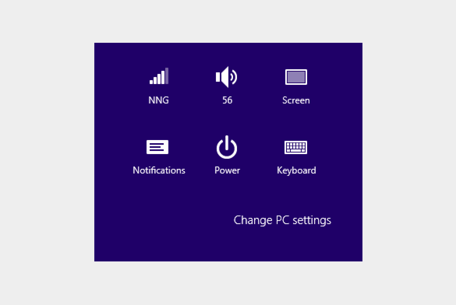 Image 3: Icons by themselves don’t always convey clickability, as seen in Windows 8.
Inconsistency could easily occur, especially with third-party developers trying to mimic a style. For example, even if a design includes clickable items, their clickability may be signalled through different colors and styles, like in iOS. For example, Apple did a great job in signalling interactivity, but there are four different styles to do so (as seen in image 4), which decreases learnability. Third-party developers may not have the design knowledge of that and might have issues designing a consistent and effective interface. Image 4 shows a failure in signaling interactivity.
Finally, the heavy reliance on icons might be a problem with flat design. Some icons explain their purpose to users, while some are abstract. The Android share icon, for example, doesn’t explain its purpose without additional text. This drastically reduces learnability. (iOS uses a different share icon, which also reduces learnability.)
Things to keep in mind when designing
After consolidating all the different pros and cons of skeuomorphism and flat design, here are some important areas to keep in mind when designing interfaces (NN Group: Flat-Design Best Practice):
- Skeuomorphism should be used in niche areas where there is a steep learning curve to the product and relating it to real life could help ease that curve.
- Documentation and third-party developer support are important to craft a consistent product across different sites.
- Make sure users can discover interactive elements.
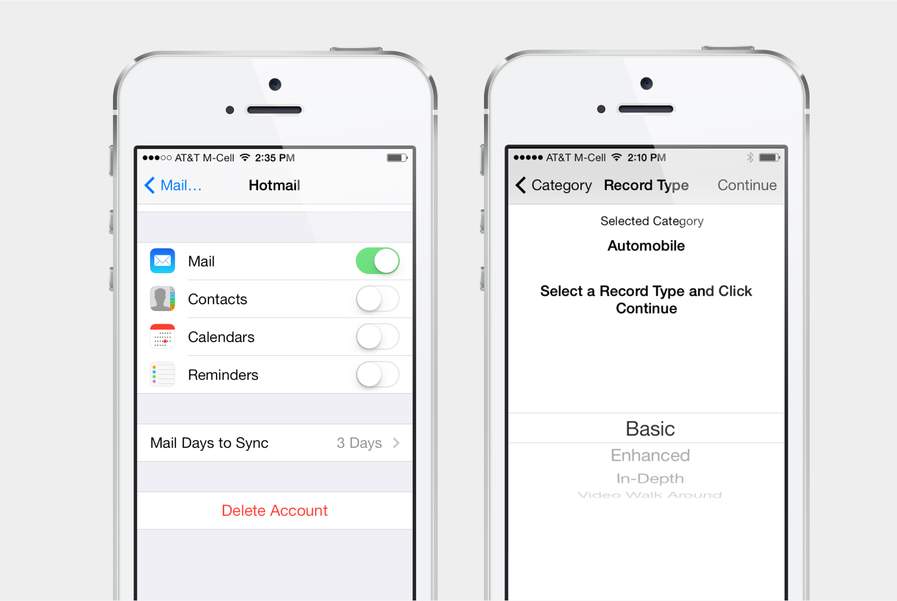 Image 4: iOS (left) and a third-party app (right) signal clickability in different ways.
For more examples & inspiration
Google introduced Material Design in 2014, and it could be considered a “middle ground” between skeuomorphism and flat design. Its use of metaphors in design consistently informs users of interactivity and hierarchy. Cards, drop shadows, and subtle animations all allow users to know that the interactive interface element.