

Navigate back to Articles page
Navigation elements like menus and breadcrumbs often play two roles:
- They assist in wayfinding.
- They also reflect the web product’s architecture, or hierarchy and organization. If a web space has a lot of unorganized pages, its navigation will likely reflect that—and users may struggle to find what they need.
Flat vs. deep hierarchy
You can architect web spaces using a flat hierarchy, which doesn’t have a lot of vertical levels, or a deep hierarchy, which has more sublevels. Each has pros and cons:
- Flat hierarchies allow content to be more discoverable since it’s not as hidden, but there is a risk that users might be overwhelmed by the number of choices to make upfront.
- Deep hierarchies can accommodate more content, but they may disorient visitors (NN Group).
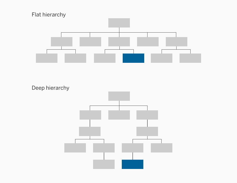
Image 1: Flat hierarchy vs. deep hierarchy
Website navigation
Websites generally have three to four levels (UX Booth). When sites have more than that, navigation menus are usually not enough to signal a user’s location. At this point, it’s important to optimize your site’s wayfinding system.
Marketing websites often include more information than actions. In these cases, use categories to label menu items, as they describe what users can find. For example, a site featuring an org chart could use the department names as menu items. If categories are “distinct and recognizable,” flat hierarchies can work well.
User testing, tree testing, and card sorting are great ways to know if users can navigate through your website (regardless of hierarchy) and find what they need (NN Group).
Software navigation
Software architecture can be very similar to that of a marketing site. However, their menus are often different.
Software often uses task-based menus, targeting users who need to get something done (IC Thrive). These menu items (often buttons) should use action language, like “Request time-off” or “Fill out a support ticket.”
However, if there are many actions to perform, top-level menus shouldn’t include all of them (or use action language). Consider grouping them together, so users have fewer choices to make upfront (Freed Employee Experience Consulting).
Navigation elements
Different navigation elements achieve different types of navigation in different screens. There are three types of navigational directions:
- Lateral navigation, or moving across screens of the same level
- Forward navigation, or moving between consecutive levels
- Reverse navigation, or moving backwards through screens (Material Design: Types of Navigation)
Below are some user interface (UI) elements that users often encounter, what type of navigation it achieves, and things to keep in mind when using them.
Breadcrumbs
Breadcrumbs are incredibly useful in providing contextual information of the users’ current location and where they could go. It achieves reverse navigation. There are three main types of breadcrumbs:
- Location based, representing the site’s structure
- Path based, representing where the user has been
- Attribute based, representing the filters applied
There are also three main points to note when using breadcrumbs.
- First, breadcrumbs should show the site’s hierarchy, not the user’s history. Therefore, we recommend not using the path-based breadcrumbs.
- Secondly, breadcrumbs should not be used as a replacement for the primary navigation. Breadcrumbs are meant to be a convenience feature and aren’t the focal point of the design.
- Finally, avoid using breadcrumbs on mobile sites as the structure of mobile sites/apps should not be too deeply nested. Breadcrumbs are also not commonly used on mobile sites as there are better alternatives in navigating through a mobile site (UX Planet).
Navigation menus & sliding drawers
Navigation menus appear generally as bars on the top and on the left of a website, and they give an overview of the top-level destinations in the website. They achieve lateral navigation. While some navigation bars “stick” to the top of the page, some don’t. Sticky navigation bars are ideal for lengthy websites where a lot of scrolling is needed.
However, on mobile, the screen is not wide enough to display a full navigation bar and all the necessary links at once. As a result, a lot of websites turn to hamburger menus/sliding drawers, which frees up screen real estate. Although it creates a better visual design, you might sacrifice engagement by using sliding drawers.
In an A/B test for Zeebox (image 2), where 15% of mobile users see a sliding drawer, and 85% saw a top navigation bar, the company found out that users liked the sliding drawer better, but engagement dropped by 50% and average weekly frequency dropped 36%.
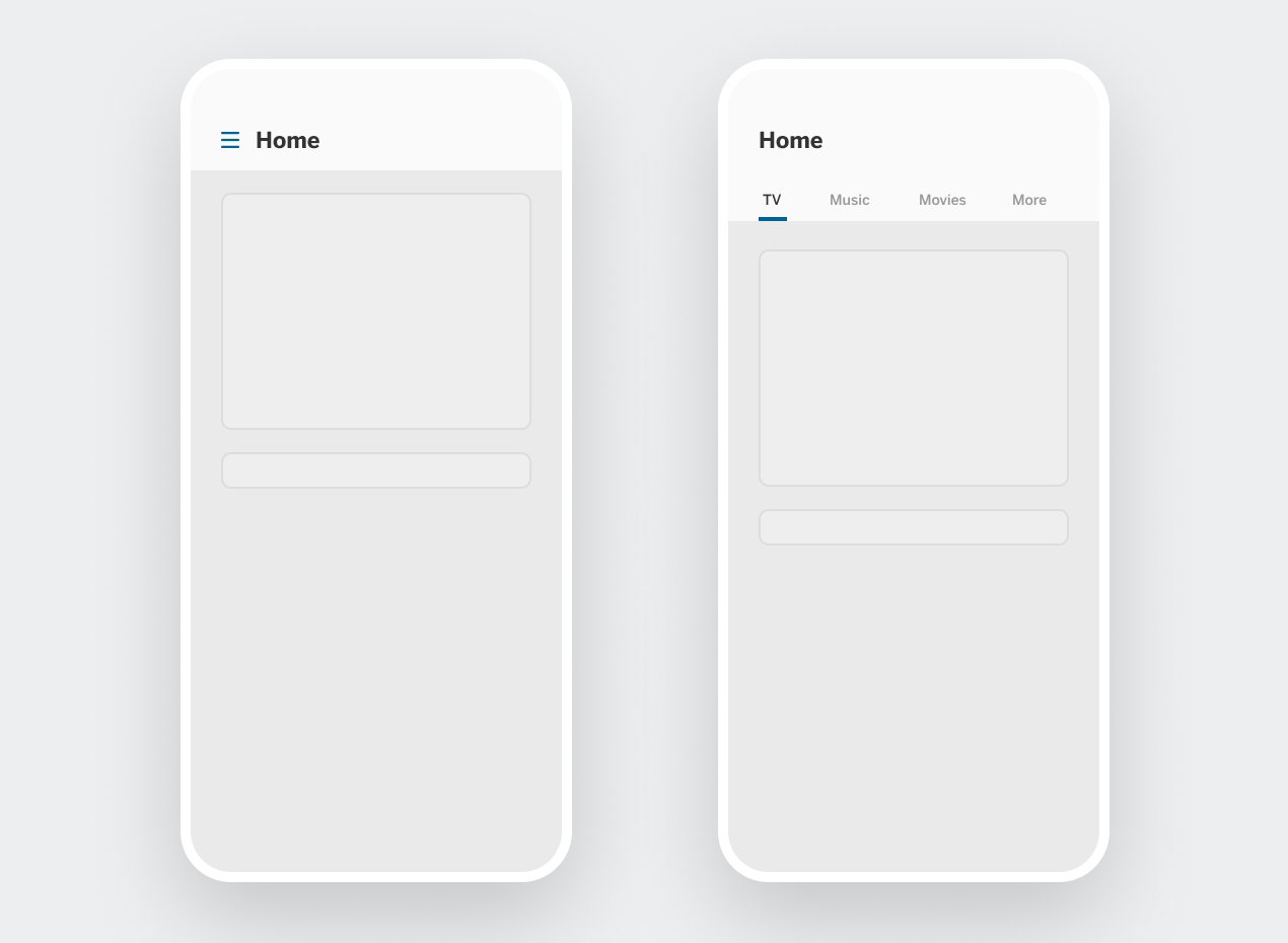
Image 2: ZeeBox A/B testing
Sliding drawers also don’t answer the question of “Where am I?” or “Where can I go?” since the answers are buried within the menu. Because of other similar research results, companies like Facebook have moved away from sliding drawers to a “More” tab in the navigation bar. However, Material Design still adopts sliding drawers.
Sliding drawers can be used successfully in some contexts. If your users spend most of their time on one single view, burying lesser-used pages like settings and options in a sliding drawer can help keep the interface clean. However, if users engage in different screens equally, using a navigation or tab bar instead of a drawer on mobile helps boost engagement (The Next Web).
Bottom navigation bars
Bottom navigation bars are mostly used on mobile devices and provide lateral navigation for up to five destinations. It allows users to know their current location and where they could go next in the app. Although this UI element seems simple, there are a few things to keep in mind when designing with these navigation bars:
- First, use caution when having a top and bottom navigation bar on the website/app, as this might confuse users about the relationship between the two (Material Design: Bottom Navigation).
- Second, make sure the bottom navigation bar is always visible regardless of where the user is (except for modal views, which should only be used for self-contained processes). These bars allow people to jump between different sections of the app and jump back to the same place easily. Hiding the bottom navigation bar limits how the user can discover and navigate the app (UX Planet).
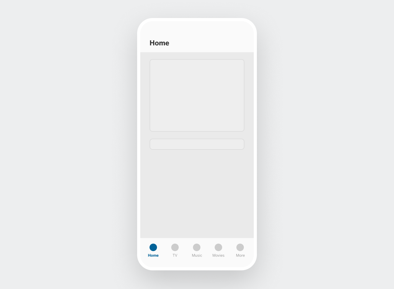
Image 3: Bottom navigation bar