Navigate back to Articles page

Team
Development: Nathan Skky Rodriguez, Clinton McKay, David Waicukauski
Design: Sandeep Bedadala
University Division team: Laura Ivins, Zachary Willhite
Illustration: Kayla Barnes
Overview
Every weekday during the school year, Maxwell Hall is busy with students who show up to meet with their academic advisors for advice regarding academic success. To make sure every student has access to advising, University Division (UD) has started using the Student Appointment Scheduler (SAS) to schedule advising appointments. SAS allows students to schedule appointments directly with advisors based on factors like advisor availability and specialization.
Problem
SAS simplified the process of scheduling appointments, but the issues related to processing appointments persisted. Here’s a typical advising scenario: A student shows up for their appointment or a drop-in session, they inform the front-desk person, and the front-desk person alerts the advisor of the student’s arrival. This sequence has the following issues:
- It created a lot of work for the front-desk assistants: They had to process students (i.e., verify an appointment), maintain the list of ongoing appointments, and inform an advisor of a student’s presence.
- Processing delays at the front desk kept the advisors waiting and delayed the beginning of an appointment session.
- Processing delays led to longer wait times for students who show up for drop-in sessions.
- Advisors did not have a way to manage a student’s appointment record when, for example, a student missed their appointment or when they arrived late.
All the above issues were aggravated during busy days like welcome week and the first two weeks of every semester when students add or drop classes.
UD approached OVPUE IT to build a tool that would address these issues and allow students to check into their appointments or drop-ins. This in turn would benefit all audiences:
- The tool would reduce the burden on the front-desk assistant who orchestrates the entire appointment workflow.
- It would give advisors the information they need to more efficiently manage their time.
- It would save hundreds of hours lost in delays and wait times for both students and advisors.
- Finally, it would create records of appointment histories, which is useful to advisors.
Designing an application that would work simultaneously between three different user groups posed interesting UX challenges. Moreover, there were specific technical requirements: UD wanted to launch the student-facing screens in a kiosk, which included a barcode scanner. That would let students use their CrimsonCards to check in.
Phase 1: Pilot study
We started off with a focus group composed of our different stakeholders (advisors, front-desk assistants, UD administrators). Our conversations helped us understand the intricacies of academic advising, and we uncovered edge cases specific to each user group. Based on this primary research, we set the following goals for our initial design:
- Limit the reliance on the front-desk assistant during a session. Provide all the required information for students and advisors on the app.
- Share the advising session management tasks between the advisor and the front-desk assistant. These could include claiming a student, marking them absent, and ending the session.
- Help advisors utilize their time efficiently. Include alerts for appointment overruns and actions for delays and absentees.
Based on the different scenarios for each user, we first designed the application’s process and workflows. The process would start with a student checking into an appointment and finish with an advisor ending the appointment session. Then we developed a working prototype and launched it for one of the offices participating in advising.
Student screens
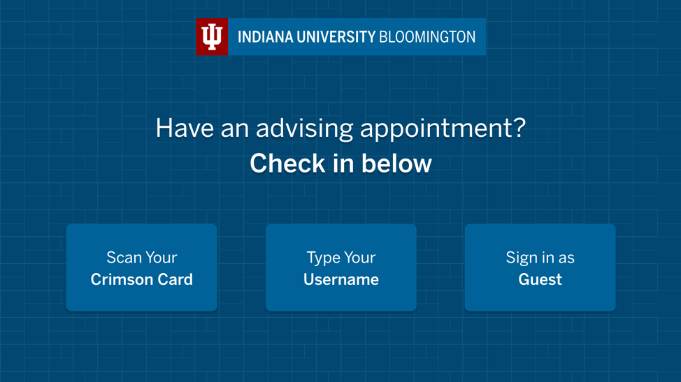
Phase one: The student’s login page
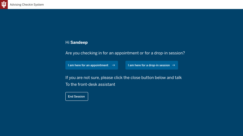
Phase one: The appointment type selection page
Two weeks into the pilot study, we learned that while the core issue for each user group was addressed, we did not completely reach our design goals. We found out that the students were having issues checking into the right appointment, and some students were confused by (and used) a feature that was meant for appointments scheduled over the phone. That meant they were accidentally creating duplicate appointments on the advisor interface.
Phase 2: Reflection and re-design
Considering the popular design principle that “bad design makes users feel stupid,” our interfaces clearly intimidated and confused students; they didn’t know where to click. Given the nature of this application, we knew that solving the problems for the students would automatically solve the issues we noticed for the front-desk person and the advisor.
We originally believed that the whole process of checking into the right appointment would take anywhere between 5-10 seconds for a new user. However, we observed it always took 15+ seconds, and users often lost their way around the interface taking unnecessary actions. Some relied on the front-desk assistant for help, and some took wrong actions that created undesirable results.
The primary goal of the student is to see an advisor—not to experience the kiosk. All the extra context that we provided only complicated the process.
Learning this lesson, we spent the next few weeks studying similar interactions in our day-to-day lives. We studied the kiosk design of organizations like Square (point-of-sale kiosk), American Airlines (airport kiosk), and McDonald’s (self-order kiosk). Through this research, we learned more about interaction design for non-personal computing devices (like kiosks). The ergonomic factors, interaction times, and visual design all played a role in delivering a smooth experience.
Advisors and administrative assistants, unlike the typical student, were using the interfaces at their desks every day. This repeated use meant they learned how to complete their tasks quickly; however, this was not the case for students. They only used this application briefly on their appointment days. Also, students were using these interfaces on the kiosk while standing—as opposed to the advisors and administrative assistants, who used the application while sitting at their desks.
Applying all of these learnings, we re-designed the student interfaces with the following major updates:
-
We changed the interfaces from being conversational—asking questions—to being intelligent. In other words, we now show only the relevant actions for the student based on their appointment record in SAS.
For example, a student who logs in at 9am for an appointment at 9:30am will see a button that allows them to check into the appointment. If there is no appointment, the student will see a search box to manually choose an advisor and a time.
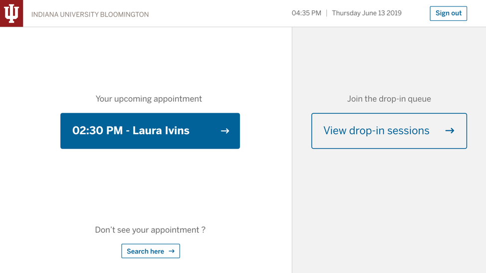
Phase two: The landing page when the student has an appointment already scheduled
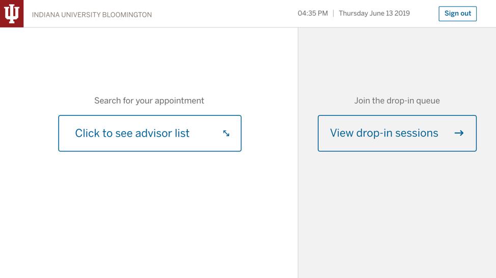
Phase two: The landing page when the student does not have an appointment made through SAS
-
We stripped any additional information on the screen that does not help the student with checking into the system. For example, we eliminated the welcome text and other information. This slowed down the user, who was scanning the screen just for the right action.
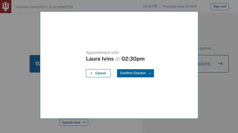
Phase two: The appointment check-in confirmation screen
-
We changed the interfaces into a two-column layout and increased the font and button sizes. That created more area for tapping on the screen.
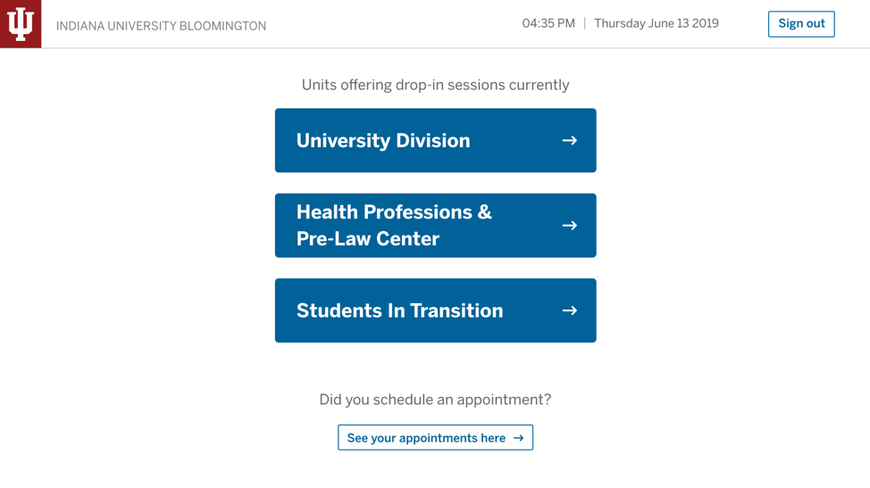
Phase two: The drop-in session landing page
Results
The re-design solved all the issues that we found out during the pilot study, and during a follow-up usability test we observed students having no issues checking into the right appointments. The new design reduced the number of steps it takes to check into the right appointment from 7am to 3pm—and it eliminated the issues faced by both the advisors and the front-desk assistant.
Next steps
Two other offices (Health Professions & Pre-Law Center, Career Development Center) in the Office of the Vice Provost for Undergraduate Education (OVPUE) adopted this tool for conducting advising sessions. The tool will be adopted in the future to work for other units in OVPUE that deal with student appointments. The success of this tool motivates us to further brainstorm ideas for tools that can enhance the advising experience beyond appointments—applied to the entire service.