Navigate back to Articles page

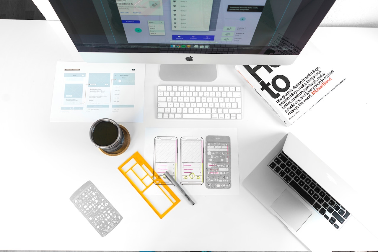
Prototyping can be time-consuming and expensive, but it offers a lot of benefits for a number of roles.
For managers, an early drawing can save a lot of design time and rework dollars. Starting with a drawing can help you discover and address the unknown aspects of your goal, and make better decisions about the product you are working on.
For designers, sharing early drawings with clients can help everyone have matching expectations. Design can serve as an effective upfront planning process just like spec lists and budgeting.
This article focuses on prototyping software, but you can apply the same concepts to other documents such as reports, charts, data dashboards, and static web pages.
What is a prototype?
A prototype is a proposed solution, so you need to identify the problem and have a solution that you want to propose. From there you can create the following:
Picture
A prototype doesn’t need to be pretty. It can be just a visual representation of a concept.
Plan
A prototype shows how to move your solution forward. It can also guide developers through non-technical details like design, layout, and page structure.
Test
A prototype is a concrete thing you use to show users and get feedback on an idea. It can answer this question: “Does this solution meet business goals and user goals together?”
Prototyping methods
There’s a lot to consider when choosing a prototyping method: skills, time available, and the kinds of decisions you need to make. Each method has its own strengths and lets you focus on different aspects of your solution.
Ultimately, what matters most is not the tool you are using, but the decisions you intend to make, and working in a way that makes your team comfortable.
Sketch
A basic hand-drawn representation of a solution. Usually a throwaway piece of paper, used to address a single decision about content.
Synonym
Paper prototype
Strengths
Sketching is a great way to explore ideas early. It’s fast, cheap, and even easier than making a flowchart. No specialization is needed, and your content doesn’t need to be final to create an effective paper prototype.
Sketches are great for testing the basics and making big decisions. Questions like ”Should this application have a search?” or “Will users know to press the login button?” are appropriate topics for sketches. They are also easy to iterate.
Weaknesses
These require trust and imagination. Going straight from a sketch to production requires a lot of interpretation. You must test these in person, which can be tedious.
When paper prototyping gets complex (using other tools like tape or scissors, or multiple pieces of paper to show interaction), that is a good sign you should consider a different method.
Wireframe
A wireframe is a line drawing that takes your content and adds structure. Think of a wireframe as a skeleton of your final product.
Synonym
Grey box (when the boxes are grey), site map, diagram
Strengths
Wireframes are good for addressing large decisions. Writers can use them to develop real content, and developers can use them as a starting point for architecture and design. Depending on your team’s development workflow, this might be the end of your design process (especially if you’re working with a component library such as Rivet).
Conversations about colors and images can be very time consuming, and wireframes allow you to save those for later. They draw attention on the decisions that are important at this stage of creation.
Weaknesses
Basic wireframes are fast, but really good wireframes are not, especially if your client can’t imagine the progress from wireframe into a production tool. When a client starts asking questions like “What color is this button going to be?” that’s a good sign to move to a higher fidelity prototyping method.
Common tools
Illustrator, Axure
Mockup
A mockup takes established content and structure, and it adds visual design using things like typography, images, branding, and design systems. The goal of a mockup is often to have a representation of your product for a client to review, or to hand a design off to developers.
Synonym
Design mockups, comps
Strengths
Mockups look nice and feel final. They are good for solving detail problems. Want to know if a different hero photo will be more effective? This is a good method for that decision. Most designers know the tools to make these, and most developers know how to work with these.
Weaknesses
Mockups are time intensive to create, and the traditional tools are not great for sharing yet. The popularity of this method dropped off with the advent of responsive web design, and the market around tools mostly became stagnant as software companies started to focus on interaction.
Common tools
Photoshop, Illustrator
Interactive prototype
These take our content, structure, and visual design and add interaction. They closely simulate the most important parts of the user experience, often accept and respond to user input, and respond to the user’s environment.
Synonym
Clickable prototype, functional prototype, front-end prototype (when it’s code based)
Strengths
Clickable prototypes are typically polished enough to be presented as tests of real systems to real users. With very few caveats, they should look and behave like a final product.
They shouldn’t require imagination from a user or much interpretation from a developer. This is a great method for addressing questions about detail.
Weaknesses
These are often time consuming to create and work best with realistic content.
Common tools
You can simulate interactions in some prototyping tools like Sketch, Invision, XD and Figma. These tools use branching slideshows that respond to user input (like clicking) to present “states” of interactions (in succeeding slides). They tend to feel familiar to visual and UX designers, and they let users share resources like our Rivet UI toolkit across teams.
Code-based prototyping tools like CodePen and CodeSandbox allow for much more complexity, but they require development skills and often more time.
Though some of these tools are specifically for designers, architects, or developers, they generally benefit from all three skill sets.
Getting started
There is a lot of overlap in capabilities in these methods. Wireframes, for example, are also a decent method for addressing interaction.
Start with a conversation about what question you are trying to answer. Do a sketch, and then skip to the highest fidelity that you have the ability and time to create.
- If time is limited, focus on improvements.
- If your app is extremely complex, paper and pencil will only get you started.
- If your content was determined by a client, you can often start with a wireframe.
- If you are using a design system such as Rivet, you can probably skip some of the visual mockup work and go directly to more meaningful interactive prototypes.
There really is no bad method to start with as long as you are open to working in lower fidelities when you run into bigger problems. And you don’t need to do every level of prototyping.


