

Navigate back to Articles page

What’s the best place to put the CTA button? Unbounce argues that scrolling has become second-nature, which means that designers can and should experiment with placing the button somewhere other than above the fold (what the user sees before scrolling). The author recommends three different places where designers could place their CTA buttons:
1. Above the fold
The most common spot for CTA buttons is above the fold. However, since user behavior has changed, placing the CTA here may mean putting it “in someone’s face before they’ve had a chance to become engaged.” So if the CTA button is put above the fold, the author suggests including additional elements to complement the button, which creates a mini-experience for the user before they scroll:
- A powerful and descriptive headline
- A complementary supporting sub header
- A brief benefit statement
- An urgency or special offer statement
- A CTA that describes exactly what you’ll get
2. Below the fold
AIDA is a marketing concept that represents Attention, Interest, Desire, and Action. Using this concept, websites can guide the user through a marketing story and have the CTA at the bottom of the page. Below are some ways to achieve individual AIDA components:
- Attention: Capture the user’s attention with a relevant and punchy headline
- Interest: Use videos or additional content to generate interest
- Desire: List and explain the features that benefit and appeal to the users
- Action: Complete the story with a strong CTA
Example: Refactoring UI
3. Below the fold using directional cues
Similar to the second point, this design uses directional cues like arrows or long forms that overflow beyond the fold, which encourage users to scroll down on the page. This is especially useful for mobile devices, or when screen space is limited and designers often must signal that there’s more content.
Many websites (e.g., Stripe, Dropbox, etc.) now have CTA buttons placed both above and below the fold. Placing them in both locations is a kind of safety net: Users who know what they want can quickly click on the CTA button above the fold, while buttons below the fold give people who need more information a chance to digest it and convert at the end.
Note: Unbounce does caution designers not to clutter the page with buttons. Including too many buttons makes it hard for users to know what the main CTA is. Forcing the user to search for the right next step can be “like trying to find a needle in a pile of needles.” The University of Hong Kong homepage is a great example of what not to do.
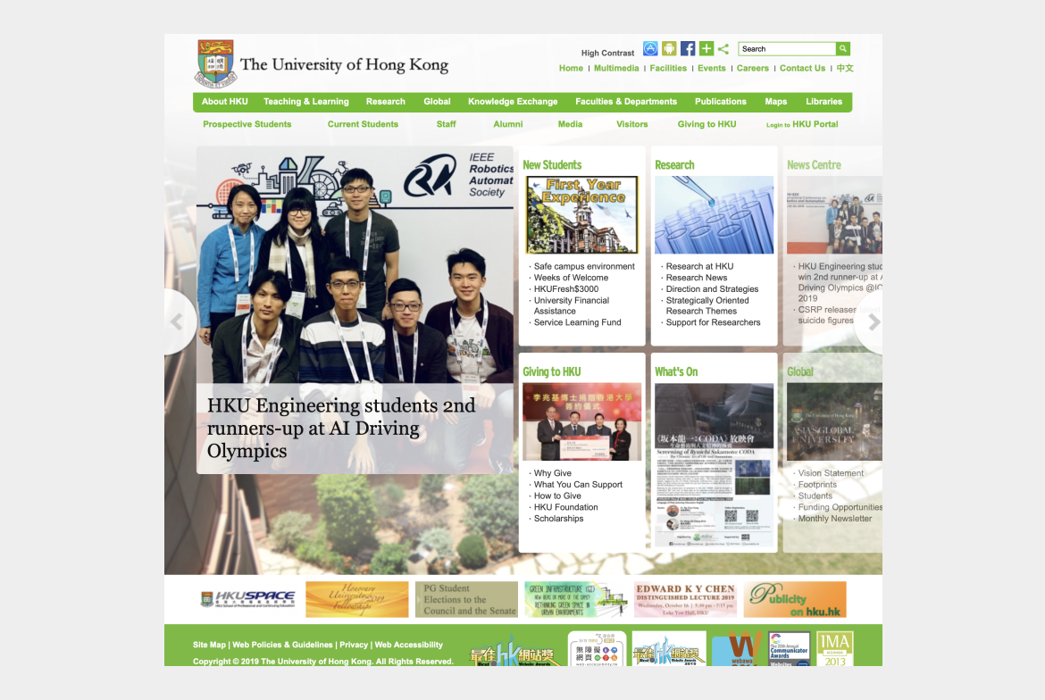 Image 1: Too many buttons clutters the page.
As users tend to read in an “F pattern,” CTAs should be placed on the left rather than the right to attract the most attention (UX Collective). Websites should also reduce clutter around the call-to-action button as it significantly increases conversion rate. VWO’s report stated a 232% increase in conversion rate by reducing clutter around the CTA button.
Button label
Writing button labels seems easy. However, without clear language, buttons could easily mislead users, or even make users commit to a destructive action accidentally. Here are a few rules for writing clear and concise button labels (UX Movement):
1. Use action verbs
Instead of using simple “yes/no” buttons in alerts, action verbs allow users to make a decision even without looking at the description text. This helps users make decisions efficiently.
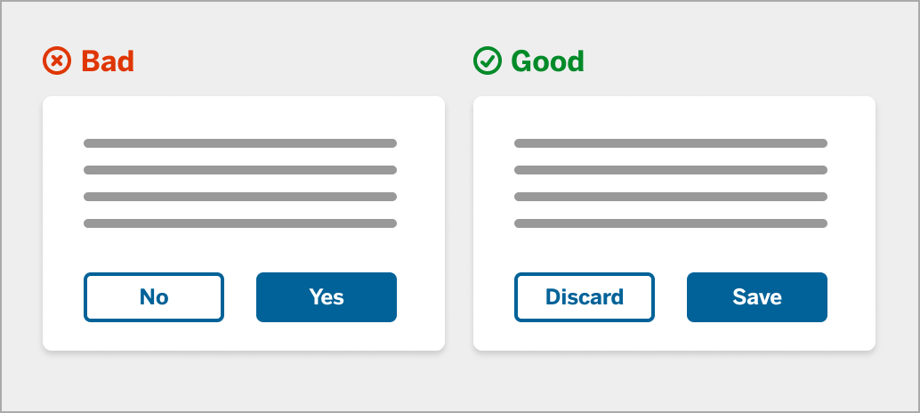 Image 2: Action verbs help users make decisions quickly.
2. Use precise language
Some words may have similar meanings (like delete and remove) but different connotations depending on the context. Using precise language reduces any misunderstandings when interpreting the buttons.
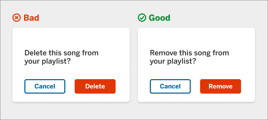 Image 3: Precise language reduces misunderstandings.
3. Use task-specific language
To let users know specifically what will happen after they click the button, avoid using vague and generic language, like “click here.”
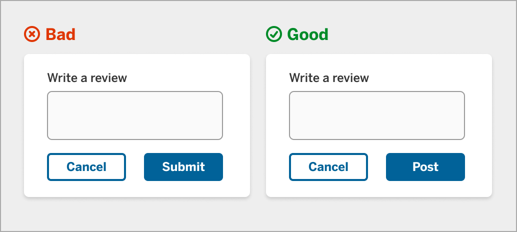 Image 4: Use task-specific language to let users know what will happen upon clicking.
4. Use commands to avoid lengthy buttons
To avoid lengthy and confusing buttons, turn phrases into commands. This allows you to drop the subject and unnecessary articles in the label.
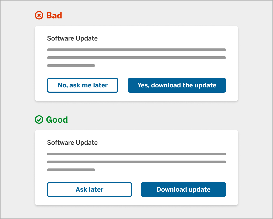 Image 4: Avoid lengthy labels.
5. Use sentence-case capitalization
Sentence-case capitalization is when a label begins with a capital letter and then uses lowercase for the remaining words. People are used to reading sentences this way, so this style makes the language more natural, friendly, and conversational, which encourages users to click on the button.
6. Use first-person language
First-person phrasing makes it clear that the user should take action.
You may consider including icons in CTA buttons to emphasize an action. People are more likely to click buttons with arrows compared to those who don’t. (Marketing Tech Blog).
Additional label examples
| Rules | Do | Don't |
| Use action verbs | Delete / Save | Yes / No |
| Use precise language | Cancel subscription / Keep subscription | Cancel / don’t cancel |
| Use task-specific language | Learn about pricing | Learn more |
| Use commands | Sign up for subscription | I want a subscription |
| Use sentence-case capitalization | Log in | Log In |
| Use first-person language (CTA buttons) | Start my free trial | Start your free trial |
Button shape
Button shapes also have an impact on the effectiveness of a CTA button. Psychology studies have shown that buttons with rounded corners are easier to look at and attract attention, as people tend to avoid “sharp” objects (in this case, buttons without rounded corners) (UX Collective).
In conclusion
Both Rivet: Button Component and the IU Web Framework: Buttons Chunk offer buttons in default shapes and types, but as we describe in this article, many additional details are up to the designer. As you decide where to place and how to label your button, keep the basics about buttons and links in mind.
Source for images 2-5: UX Movement
