
Navigate back to Articles page
Rivet currently has two sets of buttons, primary (a rounded rectangle with a solid fill) and secondary (a rounded rectangle with an outline). However, there are more button types that websites and applications generally use. Also, there is a difference between buttons and links. In this document, we detail those components and when websites should adopt them.
Call-to-action (CTA) buttons
These are buttons that encourage an action from the user. They typically have a solid fill and have the highest emphasis on the page. Generally, on a marketing site, this button is placed below a paragraph or video introducing the product to encourage conversion. However, in software, these buttons are used for the primary action for that page, such as the login button.
Since CTA buttons highly emphasize actions, they shouldn’t be placed side-by-side, as it will confuse users as to which is the more important button. If two buttons need to be placed side by side, consider using one CTA button and one ghost button.
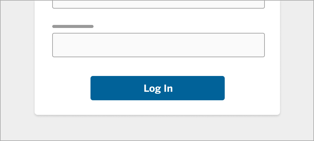 Image 1: CTA button
Ghost buttons
Ghost buttons indicate a medium emphasis and have a solid outline to draw less attention from the CTA (or primary) button.
As ghost buttons draw less attention from a user and look less like a traditional button, users are more likely to miss that this button is clickable. In one study comparing performance of both CTA and ghost buttons, users made 5% more errors using a ghost button. They paid less attention to the button and took longer to click (ConversionXL).
For this reason, context is extremely important. Designers must indicate a clickable button, which means that ghost buttons should be used with a CTA button nearby.
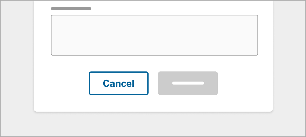 Image 2: Ghost button
Text buttons
Text buttons are buttons without any outline or fill. A text button is different from a link in that the clickable area is larger than a link, and that users could still see the button shape in its active/hover state. Designers could also further differentiate these two categories with design choices like font size, thickness, underlining, and so on. Text buttons should have the lowest emphasis compared to the previous two buttons.
Text buttons are generally used in cards, dialogs, and against images as they minimize distraction from the main content. Since text buttons have even fewer visual cues to indicate their interactivity, they should not be used as a call to action.
 Image 3: Text button
Links
Instead of a shape with a label, links are plain text with visual cues that indicate interactivity. There are a few guidelines as to how links should be styled to best show that it is clickable (NN Group):
- Use color and underline to indicate a link.
- When used in navigation menus, a link’s underline may be removed, unless the link color is red or green, as those may cause issues with the most common forms of color blindness.
- Canvas provides an option in their settings panel to turn on high-contrast UI and to underline links, which is a great option to maintain a clean design while catering to users with visual deficiency.
- Never underline or use the same link color for text that isn’t a link.
- Use different shades of the same color to indicate whether a website has been visited.
- Avoid certain hover effects like bold-facing, since this can realign text.
- Sometimes a tooltip indicating where the link will lead to is helpful.
- If a custom tooltip is not feasible, the built-in tooltip provided by most browsers will suffice in informing users the link’s destination. This can be achieved using the title attribute.
- Most links should be over 12 points, unless it is a less-needed link, like copyright info.
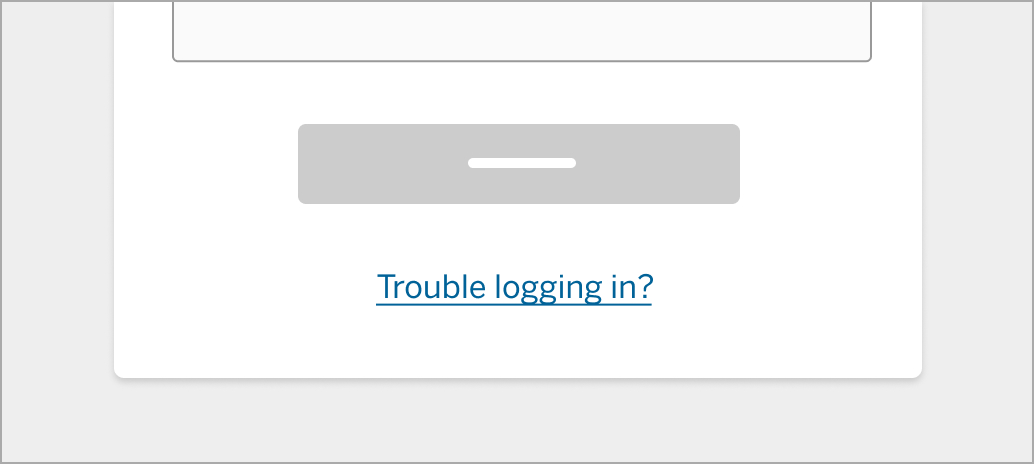 Image 4: Links
Distinguishing between text buttons and links
Although similar-looking, text buttons and links should be used in different situations (described in the next section) and should behave differently in different states. Sometimes, text buttons and links look the same, which may cause usability issues. “Forgot password?” and “Join now” have the same appearance. However, “Forgot password?” is a text button, while “Join now” is a link.
This blurs the line between the two elements. As mentioned in the Audience report, similar design elements should not be used for different purposes. In some cases, the user may be confused between the functionality of the text button and the link. To solve this problem, designers need to clearly define the difference in appearance between a text button and a link.
This is also especially important for crafting accessible experiences.
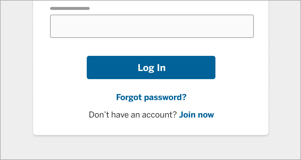 Image 5: Comparing links and buttons
Buttons vs. links
There are differences as to when a button should be used rather than a link. UX Movement wrote an article about this, and they came up with a simple rule: Buttons are used for actions that affect the website’s front-end or back-end; links are used for navigation and actions that don’t affect the website at all.
The line between buttons and links can be blurry. In many cases, an app’s CTA button may take the user to a new page as it performs that action. But for accessibility purposes, it’s important to style buttons as buttons and links as links. So if the app’s CTA only takes the user to a new page, use a link instead.
To help with this differentiation, I’ve observed how Airbnb, LinkedIn, Twitter, Google, and Dropbox use buttons and links, and I’ve come up with a few standards:
- Performs an action, like submitting a form.
- Button summons a popup or modal, or changes elements of the website.
- Label text should be short.
- e.g. “Log in”
- Text precedes or follows the link.
- e.g. “Don’t have an account? Sign up”
- Link redirects to an external site or document.
- Label text can be longer.
- e.g. “About the new look”
Colors
Colors in buttons should cater to different purposes and audiences. However, users generally prefer some colors to another (Tubik Studio):
- Blue is the most preferred color.
- Brown and orange are the least preferred.
- Cool colors are preferred over warm colors.
Marketing sites
Buttons on marketing sites should attract visitors’ attention and encourage conversion. While we know some facts about users’ preferences about colors, there is not a “perfect color” that guarantees increased conversion.
HubSpot designed a website and did A/B testing on the call-to-action button, testing if green or red would lead to more conversions. While green suggests to users the idea of “go” and red suggests the opposite, they found that the red button outperformed the green one by 21%. This could be attributed to the fact that the design of the website is green, which makes the red CTA button stand out much more. Designers can take this into account when designing CTA buttons, as contrasting the button with the overall site could increase conversion.
Software
Buttons in software should guide users through their tasks seamlessly. They should also warn users when they might encounter a destructive action. Unlike marketing sites, the use of colors has to be carefully considered to ensure users intuitively know where to click and what to avoid.
For consistency’s sake, we recommend using Rivet’s primary and secondary (ghost) buttons in most cases. In exceptional cases, like when an action is significant enough to call out, you may consider using colors other than blue.
Positive actions should be indicated using blue or green, while destructive actions should be indicated using red. Similar to buttons in marketing sites, contrast is crucial to direct users’ attention to the call-to-action. The Gmail screenshot (image 6) shows that the only colored element is the “Send” button, which stands out over other UI elements (Design Excellent UX).
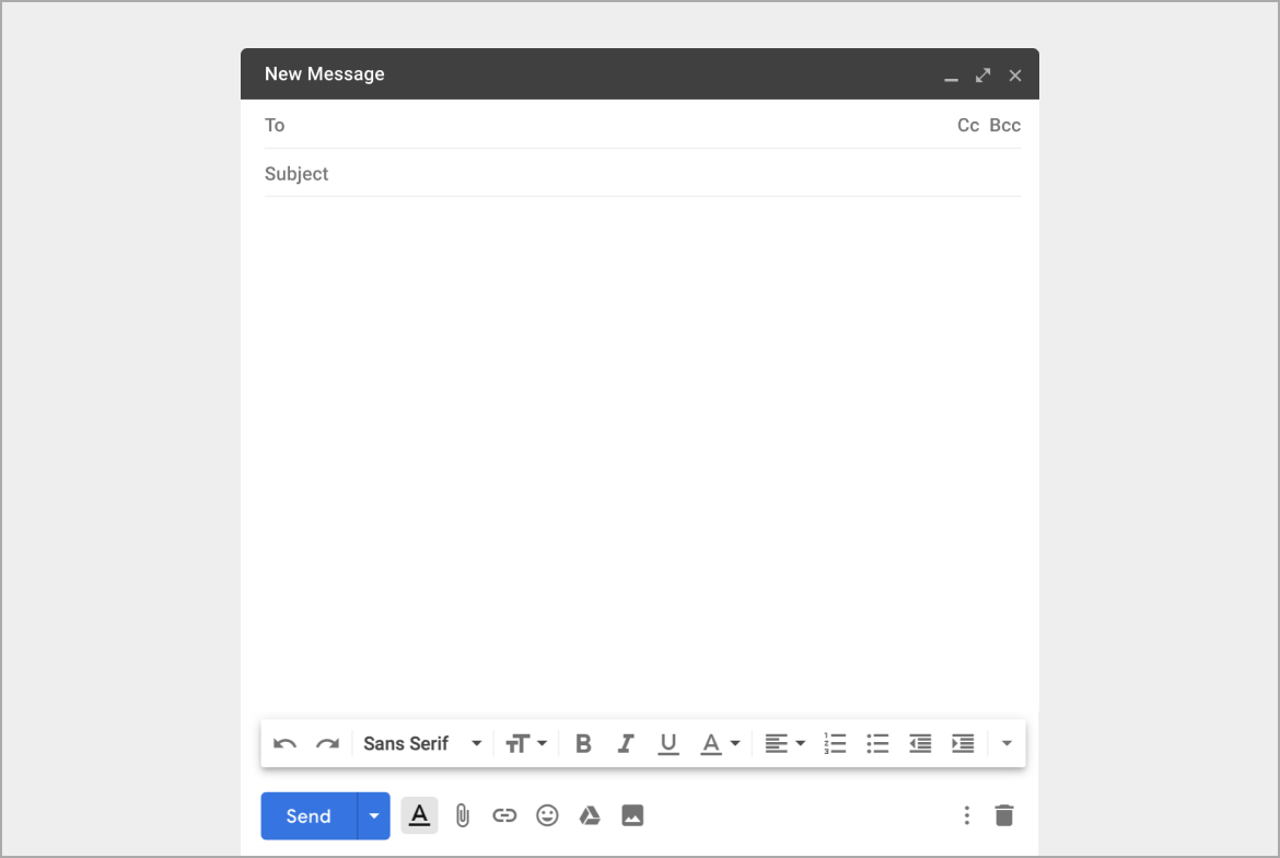 Image 6: The Gmail “Send” button stands out