

Articles
Learn about the latest happenings within the IU User Experience Community and the world.

Development
Links and buttons and JavaScript, oh my!
How you use links or buttons primarily depends on the need for user input and the intended default browser behavior.


Research & Strategy
With some structure and prompts, individuals or teams can explore a world of possibilities.
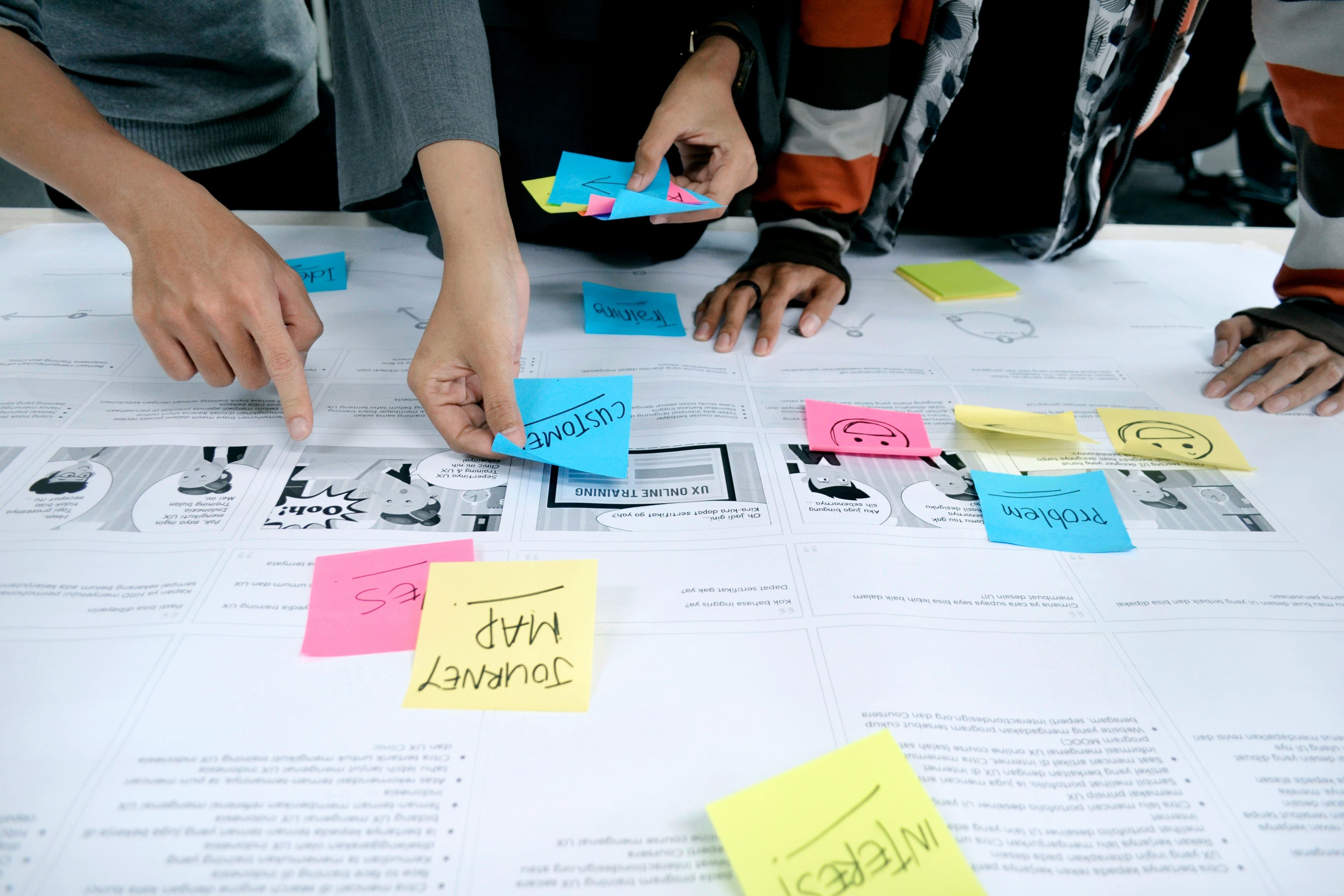
Research & Strategy
Overcome Assumptions with Impact Maps
As problem solvers, we need some way to define unexamined assumptions, test unproved assumptions, and communicate unshared assumptions.

Research & Strategy
Build the Right Thing with Impact Maps
Impact maps are a powerful and flexible collaborative tool for exploring how solutions can make an impact toward its goal.

Research & Strategy
The design of our work process can facilitate the design of better solutions for users of our work.

Research & Strategy
Explore web and software design, hierarchy, menus, UI elements, and their impact on usability and engagement.

Research & Strategy
Enhance navigation through effective UI elements and design principles, optimizing user experience.
Development
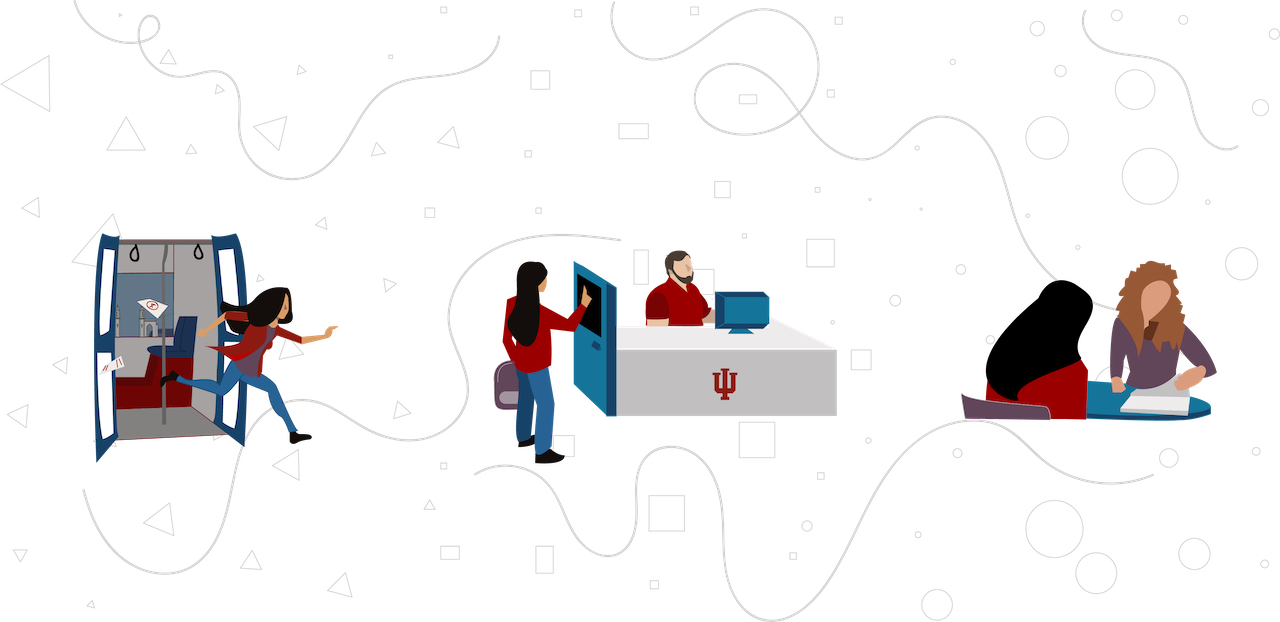
Enhancing the Full Academic Advising Experience
Streamline academic advising with efficient kiosk-based system for students and advisors.

Accessibility
Designing with Accessibility in Mind, Part 3: Patterns
Create accessible designs with tables, widgets, and error recovery strategies.


Accessibility
Designing with Accessibility in Mind, Part 2: Visuals
Ensure visual accessibility with alt text, color contrast, and meaningful graphics.

Accessibility
Designing with Accessibility in Mind, Part 1: The Basics
Master accessible design fundamentals for better user experiences.

Design & Layout
Buttons & Links: Placement, Labels, & Shapes
Optimize CTAs with clear labels, placement, and shapes for engagement.

Research & Strategy
Understand UI design differences between skeuomorphism and flat design.

Design & Layout
Design effective CTAs using proper placement, labels, and action verbs.
Content & Architecture
Choose prototyping methods based on project needs, complexity, and team collaboration.

Research & Strategy
Marketing vs. Software Audiences
Compare needs of software and marketing audiences, highlighting consistency benefits.

Design & Layout
You're a Typographer (like it or not!)
Explore typography’s role in content hierarchy and creating better user experiences.

Development
Writing Effective Documentation
Learn concise, task-focused documentation writing for developers.
Development
Discover the vital benefits of effective documentation for teams, support, and user trust.

Research & Strategy
Explore navigation elements in web and software design, their impact, and mobile differences.